Getting the Portico brand ship-shape
The ambition
Portico is an international deep water cargo terminal in Portsmouth Harbour famous for handling fruit. But, following a few design-based banana skins, the time had come to take a fresh look at the big picture for the brand.
Transforming potential…
With an established internal design team at the helm of the day-to-day, Portico needed all hands on-deck to support in the development of a new brand platform. Consistency would be key. The brand had evolved organically over the years – leading to a few unexpected challenges.
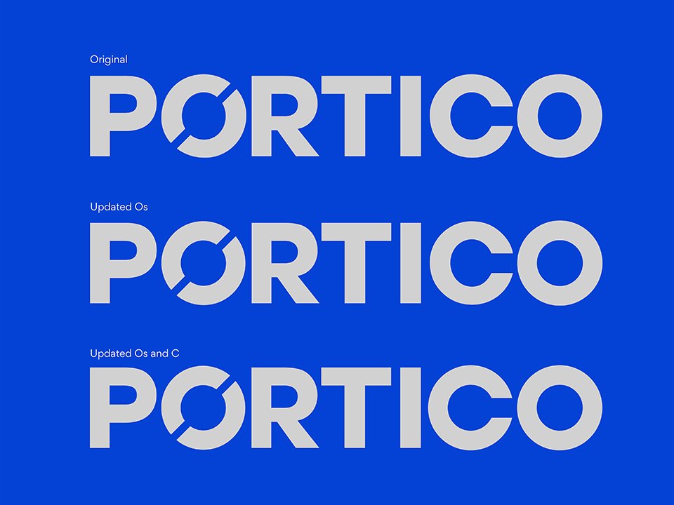
For example, we quickly realised the Portico logo itself had a problematic feature – the 'O' was not a perfect circle but rather a typographic 'O.' This had been causing problems in various applications as it was never quite central. Our small tweak made a big difference.
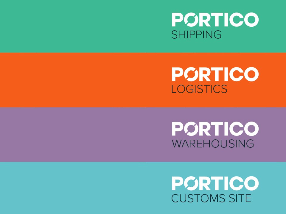
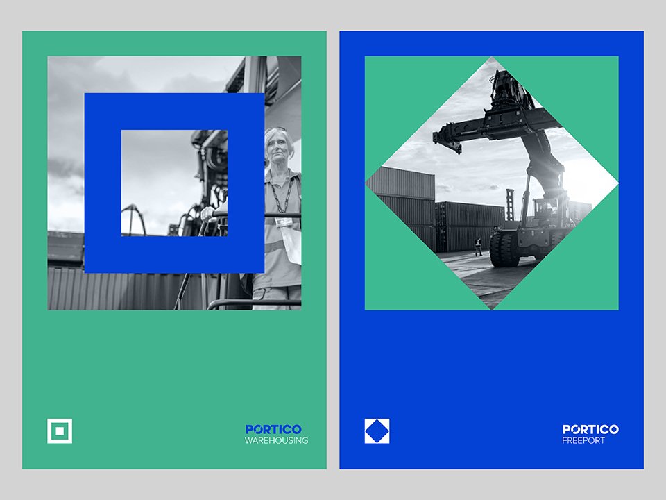
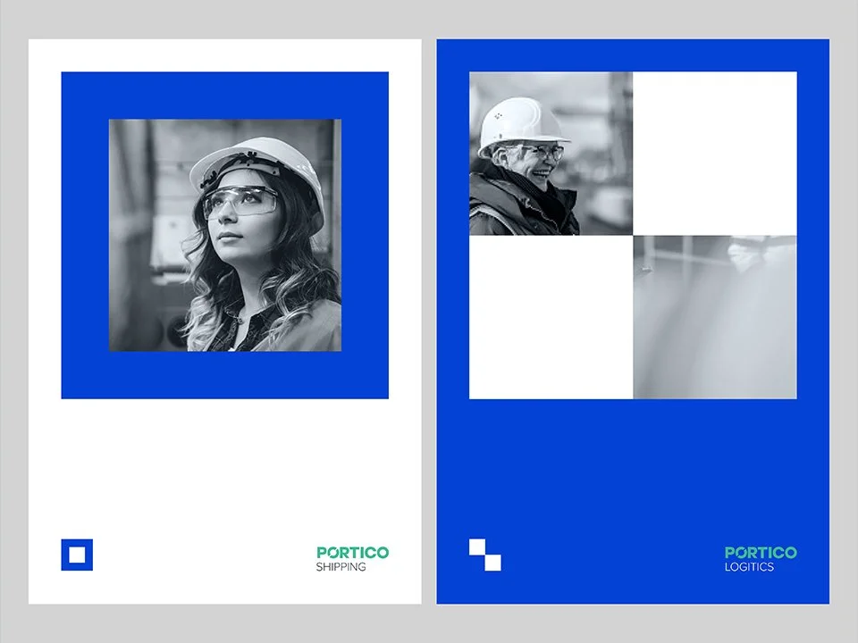
When it came to the wider brand, we explored a wide range of approaches. The chosen route was inspired by the shapes within the Semaphore flag alphabet and adopted a more eye-catching, simplified colour palette to help Portico stand out among its competitors.
…into progress
With the new brand guidelines and assets in-hand, the internal team is ready to chart their own course. While we’re always on board to offer guidance and ongoing support to help maintain the brand’s integrity. Wherever they choose to take it next.


